I’ve always been inspired by the creative ways the Brooklyn Museum uses technology to connect visitors to museum content. Now, the Brooklyn Museum is doing a major overhaul of their visitor experience--from lobby to galleries to mobile apps--in an effort to “create a dynamic and responsive museum that fosters dialogue and sparks conversation between staff and all Museum visitors.” This project is funded by Bloomberg Philanthropies as part of their Bloomberg Connects program.
I’ve been particularly interested in ASK, the mobile app component of the project. The Brooklyn team has been blogging about their progress (honestly! frequently!). To learn more, I interviewed Brooklyn Museum project partners Shelley Bernstein, Vice Director of Digital Engagement & Technology, and Sara Devine, Manager of Audience Engagement & Interpretive Materials.
What is ASK, and why are you creating it?
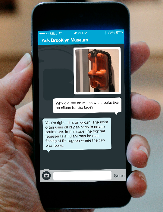
ASK is a mobile app which allows our visitors to ask questions about the works they see on view and get answers—from our staff—during their visit.
ASK is part of an overall effort to rethink the museum visitor experience. We began with a series of internal meetings to evaluate our current visitor experience and set a goal for the project. We spent a year pilot-testing directly with visitors to develop the ASK project concept. The pilots showed us visitors were looking for a personal connection with our staff, wanted to talk about the art on view, and wanted that dialogue to be dynamic and speak to their needs directly. We started to look to technology to solve the equation. In pilot testing, we found that enabling visitors to ASK via mobile provided the personal connection they were looking for while responding to their individual interests.
Are there specific outcome goals you have for ASK? What does success look like?
We have three goals.
Goal 1: Personal connection to the institution and works on view. Our visitors were telling us they wanted personal connection and they wanted to talk about art. We need to ensure that the app is just a conduit to helps allow that connection to take place.
Working with our team leads and our ASK team is really critical in this—we’ve seen that visitors want dialogue to feel natural. For example, staff responses like: “Actually, I’m not really sure, but we do know this about the object” or encouraging people with “That’s a great question” has helped make the app feel human.
Goal 2: Looking closer at works of art. We’d like to see visitors getting the information they need while looking more closely at works of art. At the end of the day, we want the experience encouraging visitors to look at art and we want screens put to the side. We were heartened when early testers told us they felt like they were looking more closely at works of art in order to figure out what questions to ask. They put down the device often, and they would circle back to a work to look again after getting an answer—all things we verified in watching their behavior, too.
Moving forward, we need to ensure that the team of art historians and educators giving answers is encouraging visitors to look more closely, directing them to nearby objects to make connections, and, generally, taking what starts with a simple question into a deeper dialogue about what a person is seeing and what more they can experience.
Goal 3: Institutional change driven by visitor data. We have the opportunity to learn what works of art people are asking about, what kinds of questions they are asking, and observations they are making in a more comprehensive way than ever before. This information will allow us to have more informed conversations about how our analog interpretation (gallery labels for example) are working and make changes based on that data.
So, success looks like a lot of things, but it’s not going to be a download rate as a primary measure. We will be looking at how many conversations are taking place, the depth of those conversations, and how much conversational data is informing change of analog forms of interpretation.
You’ve done other dialogic tech-enabled projects with visitors in the past. Time delay is often a huge problem in the promise of interaction with these projects. Send in your question, and it can be days before the artist or curator responds with an answer. ASK is much more real-time. As you think about ASK relative to other dialogic projects, is timeliness the key difference, or is it something else entirely?
How much “real time” actually matters is a big question for us. Our hunch is it may be more about how responsive we are overall. Responsive means many things—time, quality of interaction, personal attention. It’s that overall picture that’s the most important. That said, we’ve got a lot of testing coming up to take our ASK kiosks—the ipads you can use to ask questions if you don’t have or don’t want to use your iPhone—and adjust them to be more a part of the real time system. Also, now that the app is on the floor we’re testing expectations that surround response time and how to technically implement solutions to help. There’s a lot to keep testing here and we are just at the very beginning of figuring this out.
That’s really interesting. If the conversations are about specific works of art, I would assume visitors would practically demand a real-time response. But you think that might not be true?
In testing, visitors were seen making a circle pattern in the galleries. They would ask a question, wander around, get an answer and then circle back to the work of art. Another recent tester mentioned that the conversation about something specific actually ended in a different gallery as he walked, but that he didn’t mind it. In another testing session, a user was not so happy she had crossed the gallery and then was asked to take a picture because the ASK team member couldn’t identify the object by the question; she didn’t want to go back. This may be one of those things people feel differently about, so we’ll need to see how it goes.
If we are asking someone to look closer at a detail (or take a photograph to send us), we’ll want to do that quickly before they move on, so there’s a learning curve in the conversational aspect that we need to keep testing. For instance, we can help shape expectations by encouraging people to wander while we provide them with an answer and that the notifications feature will let them know when we’ve responded.
Many museums have tried arming staff with cheerful “Ask me!” buttons, to little effect. The most common question visitors ask museum staff is often “Where is the bathroom?” How does ASK encourage visitors to ask questions about content?
Actually, so far we’ve had limited directional, housekeeping type questions. People have mostly been asking about content. Encouraging them to do more than ask questions is the bigger challenge.
We spent a LOT of time trying to figure out what to call this mobile app. This is directly tied into the onboarding process for the app—the start screen in particular. We know from user testing that an explanation of the app function on the start screen doesn’t work. People don’t read it; they want to dive right into using the app, skimming over any text to the “get started” button. So how to do you convey the functionality of the app more intuitively? Boiling the experience down to a single, straight forward call-to-action in the app’s name seemed like a good bet.
We used “ask” initially because it fit the bill, even though we knew by using it that we were risking an invitation for questions unrelated to content—”ask” about bathrooms, directions, restaurants near by—particularly when we put the word all over the place, on buttons, hats, signs, writ large in our lobby.
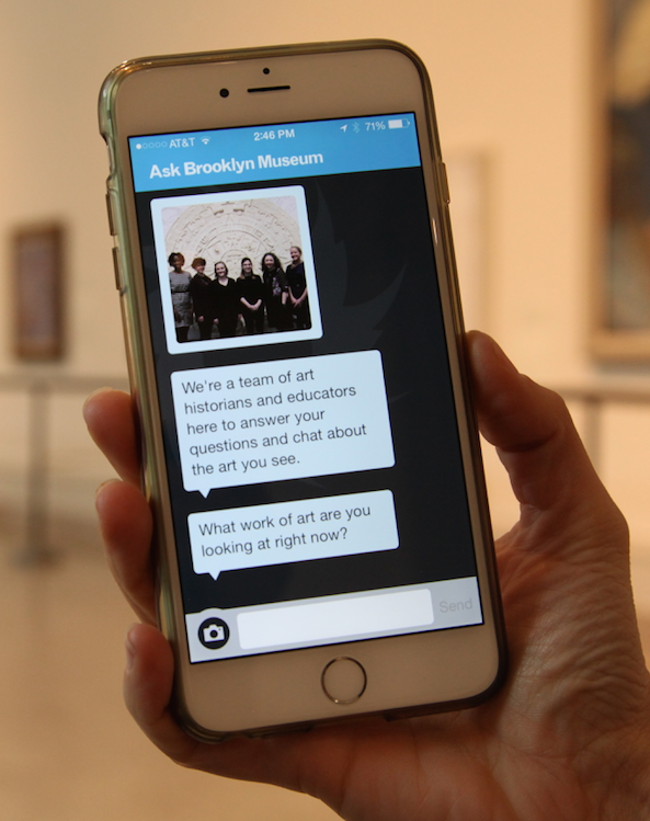
Although “ask” is a specific kind of invitation, we’re finding that the first prompt displayed on screen once users hit “get started” is really doing the heavy lifting in terms of shaping the experience. It’s from this initial exchange that the conversation can grow. Our initial prompt has been: “What work of art are you looking at right now?” This prompt gets people looking at art immediately, which helps keep the focus on content. We’re in the middle of testing this, but we’re finding that a specific call-to-action like this is compelling, gets people using the app quickly and easily, and keeps the focus on art.

Some of the questions visitors have about art are easily answered by a quick google search. Other questions are much bigger or more complex. What kinds of questions are testers asking with ASK?
It’s so funny you say that because we often talk about the ASK experience specifically in terms of not being a human version of Google. So it’s actually not only about the questions we are asked, but the ways we respond that open dialogue and get people looking more closely at the art. That being said, we get all kinds of questions—details in the works, about the artist, why the work is in the Museum, etc. It really runs the gamut. One of the things we’ve noticed lately is people asking about things not in the collection at all—like the chandelier that hangs in our Beaux-Arts Court or the painted ceiling (a design element) in our Egypt Reborn gallery.
Visitors’ questions in ASK are answered by a team of interpretative experts. Do single visitors build a relationship with a given expert over their visit, or are different questions answered by different people? Does it seem to matter to the visitors or to the experience?
The questions come into a general queue that’s displayed on a dashboard that the ASK team uses. Any of the members of the team can answer, pass questions to each other, etc. Early testers told us it didn’t matter to them who was answering the questions, only the quality of the answer. Some could tell that the tone would change from person to person, but it didn’t bother them.
We just implemented a feature that indicates when a team member is responding. Similar to the three dots you see in iMessage when someone on the other end is typing, but our implementation is similar to what happens in gchat and the app displays “[team member first name] is typing.” In implementing the feature this way, we want to continually bring home the fact that the visitor is exchanging messages with a real person on the other end (not an automated system). Now that we’ve introduced names, it may change expectations that visitors have about hearing from the same person or, possibly, wanting to know more about who is answering. This will be part of our next set of testing.
The back-of-house changes required to make ASK possible are huge: new staff, new workflows, new ways of relating to visitors. What has most surprised you through this process?
This process has been a learning experience at every point... and not just for us. As you note, we’re asking a lot of our colleagues too. The most aggressive change is more about process than product. We adopted an agile planning approach, which calls for rapid-fire pilot projects. This planning process is a completely new way of doing business and we have really up-ended workflows, pushing things through at a pace that’s unheard of here (and likely many other museums). One of the biggest surprises has been not only how much folks are willing to go-with-the-flow, but how this project has helped shape what is considered possible.
In our initial planning stages, we would go into meetings to explain the nature of agile and how this would unfold and I think many of our colleagues didn’t believe us. We were talking about planning and executing a pilot project in a six-week time span—absolutely unreal.
The first one or two were a little tough, not because folks weren’t willing to try, but because we were fighting against existing workflows and timelines that moved at a comparatively glacial pace. The more pilots we ran and the more times we stepped outside the existing system (with the help of colleagues), the easier it became. At some point, I think there was a shift from “oh, Shelley and Sara are at it again” to “gee, this is really possible in this timeframe.”
After two years of running rapid pilots and continuing to push our colleagues (we’re surprised they’re still speaking to us sometimes!), we’ve noticed other staff members questioning why projects take as long as they do and if there’s a better way to plan and execute things. That’s not to say that they weren’t already having these thoughts, but ASK is something that can be pointed to as an example of executing project—on a large scale and over time—in a more nimble way. That’s an unexpected and awesome legacy.
Thanks so much to Shelley and Sara for sharing their thoughts on ASK. What do you want to ask them? They will be reading and responding to comments here, and if you are excited by this project, please check out their blog for a lot more specifics. If you are reading this by email and would like to post a comment, please join the conversation here.


