
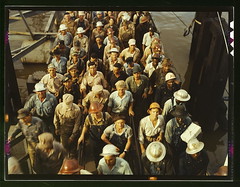
Workers leaving Pennsylvania shipyards, Beaumont, Texas (LOC)
Originally uploaded by The Library of Congress
Plenty have blogged about the initiative, but what I'm most interested in are the results, and what it means for the way we share collections with visitors both online and onsite.
Consider the difference between these two listings of the same image:
- from the LOC official collection (ugh, no permanent link... so you have to search by the name of the photo on this site)
- from Flickr
The LOC collection listing has title, metadata, and some links to other photos in the related subjects. Flickr has that content (and makes the photo easier to find)... but the gold is in the user contributions, in the form of tags (keywords to describe the photo), notes (comments inserted directly on the image), and comments (presented like blog comments, spanning down the page in time order).
In the case of this image, there are 44 user-supplied tags, 5 user-supplied notes, and 8 user-supplied comments. I know that for collections folks, it's the tags that are drool-worthy (because they form a web of cross-references that can then link this photo with others via subjects like "overalls" which the LOC might never include in their own keywords). But from an interpretative perspective, the comments and notes are where it's at.
One note highlights the fact that the black men in the photo are standing separately from the white men, saying: "Looks like 'quitting time' was as segregated as the rest of life." And here are some comments:

These folks aren't just saying, "nice pic" (except for one)... They're answering each other's questions about the content, sharing personal stories, making socio-political commentaries. They're doing things that don't happen when visiting the real collection, don't happen when visiting the official website... and it's arguably creating a more engaging, more educational experience with the content.
I'm not a photo or history buff, but I got really hooked on some of the emotional stories, feminist debates, and composition observations by users while checking out the photos. The LOC website has very little stickiness, few things to compel my continued attention. Because ultimately, it's not the photos that drive my interest. It's the people.
So maybe this isn't "LOC Rocks Flickr." Maybe it's "Flickr users rock." A nice Friday example of visitors making our content a better place.
3 comments, add yours!:
As always, great analysis. And made me think that this project would be well replicated by local historic museums/societies.
Case in point: I remember not to long ago finding the website of the Greater West Bloomfield (Michigan) Historical Society. My family has been in Oakland County, MI, since the mid-19th century. My grandparents lived in West Bloomfield from the 1960s until the 1990s, my aunt graduated from West Bloomfield High School. West Bloomfield is a very typical post war suburban landscape. Fields only 60 years ago now covered with subdivisions and strip malls.
The website is mostly snap shots that various people have given the society over the years. It was fascinating, but it was dead in that their was no way to share in the collective memory. No way to comment, to add detail, to provide background to the story of the pictures. Obviously something like the GWBHS is relatively small, it's an ideal organization to tap into the collective memory of the web and social media like Flickr from a cost perspective as well as because West Bloomfieldians are typical of the Detroit suburbanites -- educated at the quality Michigan colleges but faced with a shrinking Michigan economy, many have left when they became 22. The audience for a historical society like that is dispersed. And the nature of their existing pictures already attempt to tap into recent history and memories. Flickr would easily create the network of connections that the pictures suggest.
Why does Flickr bury the "See different sizes" link deep down into the page and make it so uncospicuous? Never let software engineers in their twenties test web pages for usability and readability: their eyesight is too good.
Paolo,
Relatedly, why does the LOC collection site show the pictures at such small size as a default (and require you to click them for something larger)? All I see is a postage stamp at first... not very impressive or visually appealing.
Post a Comment